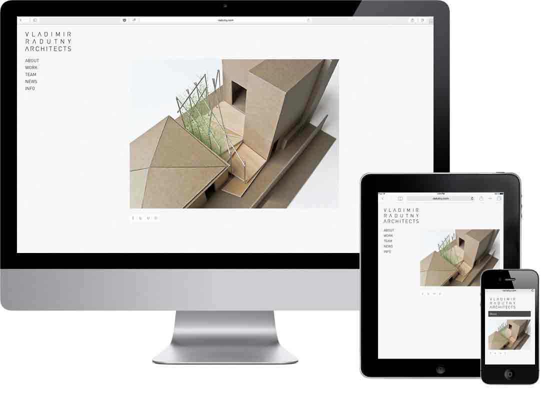
Responsive Web Design
RWD Definition:
“Responsive web design (RWD) is an approach to web design aimed at crafting sites to provide an optimal viewing and interaction experience—easy reading and navigation with a minimum of resizing, panning, and scrolling—across a wide range of devices (from desktop computer monitors to mobile phones).”
"A site designed with RWD adapts the layout to the viewing environment by using fluid, proportion-based grids, flexible images, and CSS3 media queries..."


Layout For Various Screen Sizes:

In The Past:

And Present:

"Mobile First" vs "Desktop First" design approach
You can either start your design on a small screen first ("mobile first") and then make decisions on how the layout needs to adjust/adapt on bigger screens. Or you start with the design for the big screen first ("desktop first") and then make layout adjustments for the smaller devices. The first approach is the more popular choice amongst developers since it's usually easier to adjust a simple layout for the bigger screens. A design that was developed for a big screen first may be much more difficult to adjust for a small device (depending on the complexity).
You can read more about how this is done exactly with CSS here.
"Progressive Enhancement" vs "Graceful Degradation"
Similar approaches to the ones explained above but more related to technical (script) features. Progressive Enhancement means to start with a simple setup that works on most (mobile) devices and then present the same page with more features on PCs with more capabilities. Graceful Degradation instead is the opposite: A feature rich site usually conceptualized for PCs is made technically simpler, less complex for less capable devices (usually mobile phones).
"Different" Layouts but—only one—site
Important to understand is that from a design and a technical stand point there's ONLY ONE site. So it's not the case that you design and code three different sites and one is being displayed in the browser depending on screen size. It's rather the one and the same layout/code that adapts by adding rules the the CSS file (the HTML doesn't change at all).
Although there still are cases where another, separate website is presented on a smartphone (but that's not RWD then).
Important Concepts/Methods to organize/arrange/adapt RWD
Grids:
- Grid systems create connectedness. A well-made grid can visually connect related pieces of content or, just as importantly, separate unrelated elements from each other. In other words, they help us create narratives from our layout.
- By establishing predefined alignment points, grid systems help designers solve layout problems.
- A well-designed grid system will provide visual pathways for the reader’s eye to follow, and allow them to better understand a visual hierarchy.
Relationships:
- Define relationships from your content. A grid for the web should be defined by the content, not the edge of an imaginary page.
- Use ratios or relational measurements above fixed measurements.
Hierarchy
Navigation/Interaction
Appearance, organization and functionality may change depending on the available screen width.
Responsive, Fluid Grid Example:
See the Pen Responsive, fluid grid by Oliver Roeger (@uic-des) on CodePen.
Articles:
- Ethan Marcotte's article from 2010 (started it all...)
- Frameworks (Principles for RWD)
- The Infinite Grid
- Beginners guide on treehouse
Responsive Design Patterns:
Responsive Navigation/Menu Patterns:
- Adentures in Responsive Navigation
- Responsive Layout and Navigation Patterns
- Responsive Navigation Patterns 1
- Responsive Navigation Patterns 2
Books:
Site Examples:
