RWD and Media Queries:
A design should ideally "work" on a small device such as a smartphone as well as on a big 30 inch + screen. It makes sense to optimize layout and functionality depending on screen size and device. Without it you'd need to constantly zoom in and out on smartphone to read the text or click a link, for example.
One option would be to create separate mobile and desktop versions of your website. It's often better to create one single website that adjusts itself depending on the available screen size. You can optimize your layout for different sizes and devices by applying the CSS3 Media Queries. This means that the same information (=HTML) is displayed in different ways. This can affect simple type size adjustments but often involves optimizing the whole layout grid and positioning/hierarchy of elements.
The Media Queries get activated at certain browser/device widths ("break points"). The CSS rules inside the Media Queries overwrite the default rules.
How To Add CSS
Width and Device-Width
The "device-width" refers to the physical screen width of the device, although it's still being measured in pixels. The "width" refers to the visible screens size (the "viewport") independent from the physical size of the device. Example: An iPhone 6 has a resolution of 750px in width ("device pixels"}. But Media Queries can target it using a width of 375px ("CSS pixels"} Two device/retina pixels = one CSS pixel ( 750 : 2 = 375).

For responsive layouts you usually want to make adjustments to the layout depending on the visible area independent of the device. For the Media Queries it's recommended to use the "width" property and not the "device width". There are simply too many devices around so it's much simpler to make adjustments to the layout depending on the visible screen area (viewport), no matter what smartphone or tablet somebody uses.

Occasionally you may need to target a specific device. in a desktop browser you can show information on mouse over (show link name when you rollover a button, for example). Touch screens don't have mouse overs so you could write a rules to show the otherwise hidden info by default. The example below would only target an iPad device, not a regular desktop browser.

Desktop First:
You start with a big screen (maybe with a layout of 1200px width or more). When the screen gets smaller the styles in the media queries overwrite the default styles. In the example below the container element gets progressively smaller/more narrow to make it fit into the available browser width.
In the example below a 4- column grid will turn into 3-column grid for sizes below 1200px. For sizes below 960px it displays at 2 columns and below 768px it's a 1-column layout.

See the Pen Media Queries: Desktop First Grid by Oliver Roeger (@uic-des) on CodePen.
Two More Examples:
See the Pen Mobile First Media Queries by Oliver Roeger (@uic-des) on CodePen.
See the Pen Desktop First Media Queries by Oliver Roeger (@uic-des) on CodePen.
Max-Width and Min-Width
For the "max-width": Apply the following styles to all screens that are smaller than the XXXpx value.
For the "min-width": Apply the following styles to all screens that are greater than the XXXpx value.
Mobile First vs. Desktop First
Mobile First:
You start with a small screen (maybe 320px). When the screen gets bigger the CSS styles listed in the media queries overwrite the default styles. In a series of Media Queries the ladder overwrites the preceding one.
In the example below a grid column is first 96%. If the browser/screen is bigger than 768px it displays at 46%. Together with the float declaration, we have a 2-column grid now. The layout turns into 3-column grid at 960px and to a 4-column grid at 1200px.

See the Pen Media Queries: Mobile First Grid by Oliver Roeger (@uic-des) on CodePen.
The Viewport Meta Tag
Don't forget to add the Viewport Meta Tag to the head section of you HTML files. With this tag the browser can detect mobile devices and control zooming. Below is the most common version of it. Copy it here

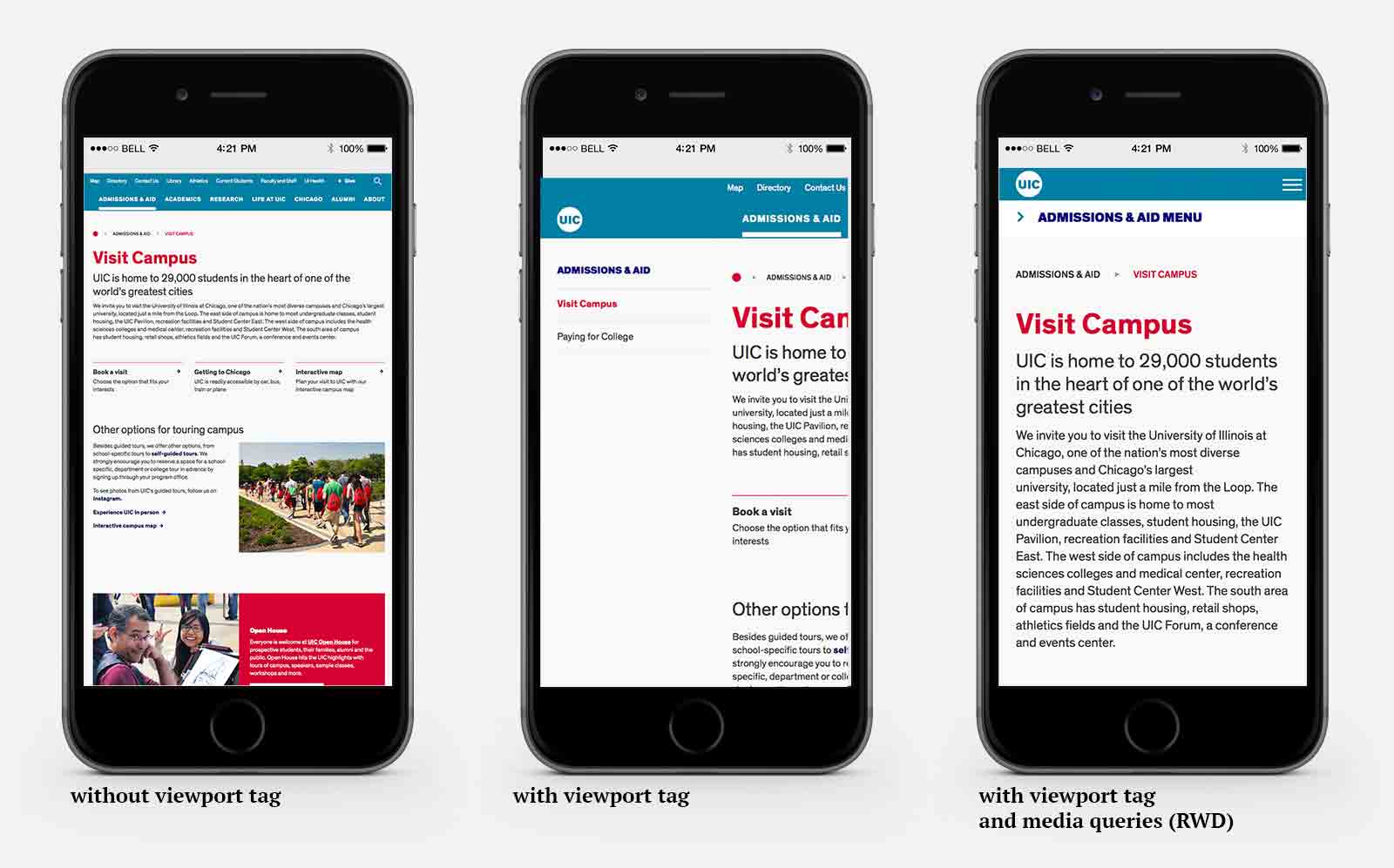
The example below shows how the viewport tag effects a layout:

There's no viewport tag in place on the left. The layout appears zoomed out which makes it necessary to zoom in if you want to read or use the navigation.
There's a viewport tag in the middle which makes the layout appear scaled 1:1 ("un-zoomed"). Horizontal scrolling is necessary to read or navigate.
The right example has viewport tag and media queries: No horizontal scrolling and easy to navigate. A size-optimized design.